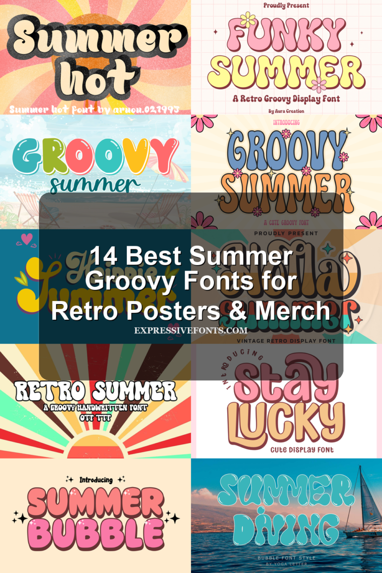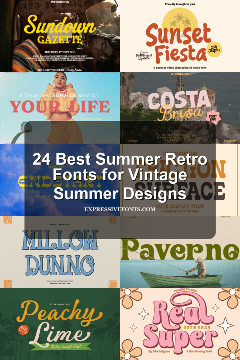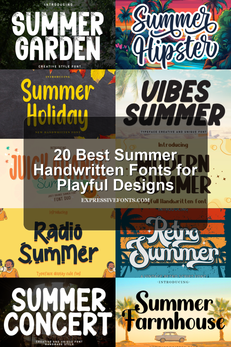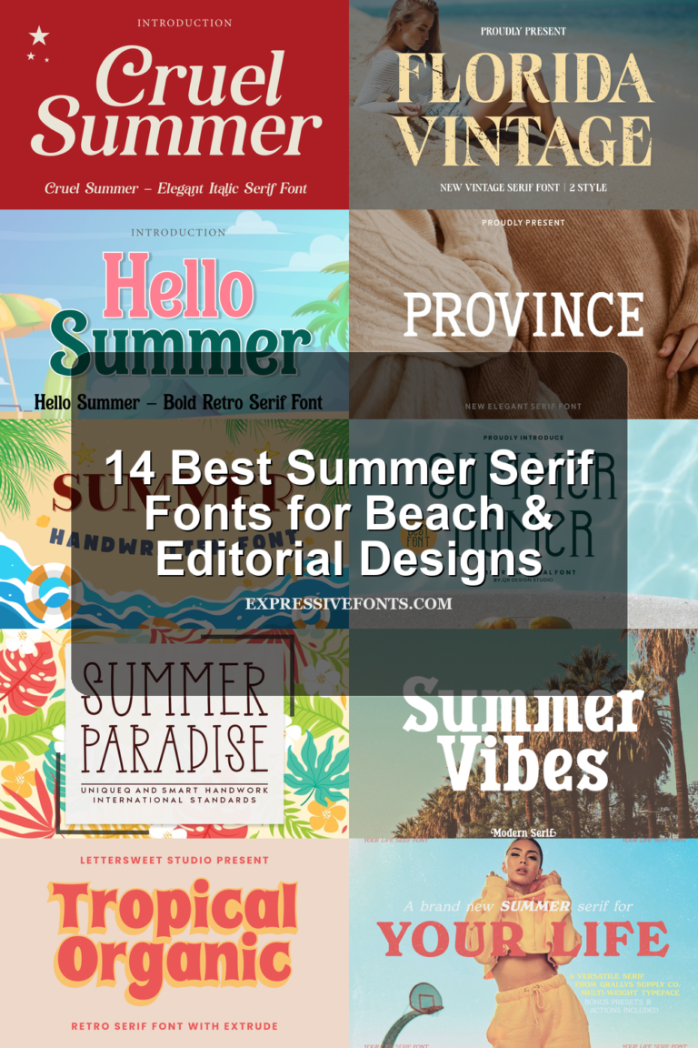
16 Best Tropical Fonts for Beach, Summer & Retro Designs
Explore 16 tropical fonts for beach posters, summer branding, stickers, invitations, packaging, T-shirts, and social graphics. The set covers retro display fonts, brush scripts, playful handwritten styles, and softer monoline options.
Sunshine Tropical Font
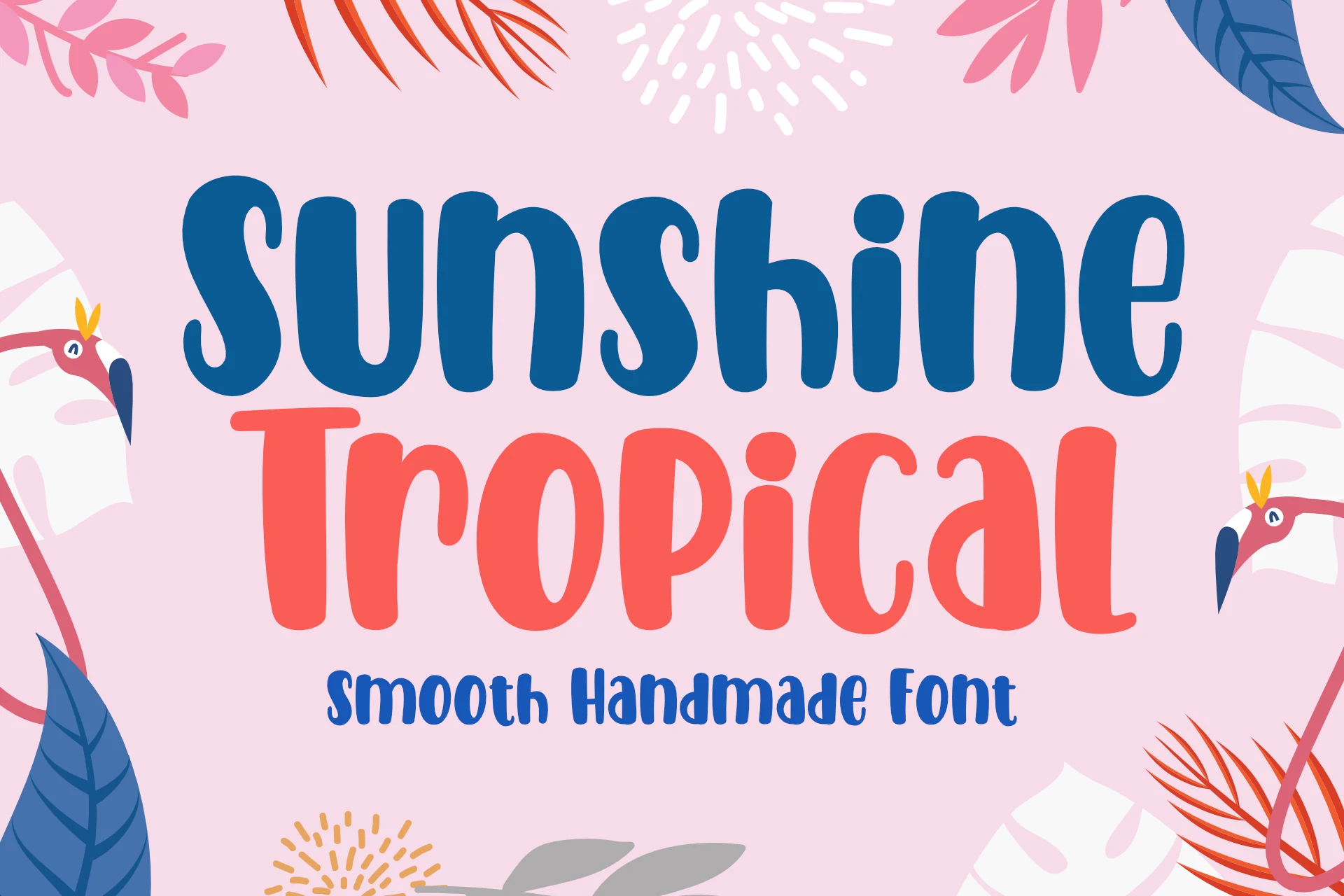
Best For: headlines, stickers, T-shirts, playful designs
Sunshine Tropical Font uses thick rounded strokes, soft handmade curves, and slightly uneven proportions that keep the lettering casual without turning messy. The chunky forms give Tropical Fonts a friendly display voice, while the open counters and smooth terminals help the words stay readable at poster or product-label scale.
It works best when the type carries the layout rather than sits inside a crowded text system. Keep spacing fairly tight to preserve the bouncy rhythm, then use strong color contrast if it goes over illustrated or busy backgrounds.
Tropical Freezer Font
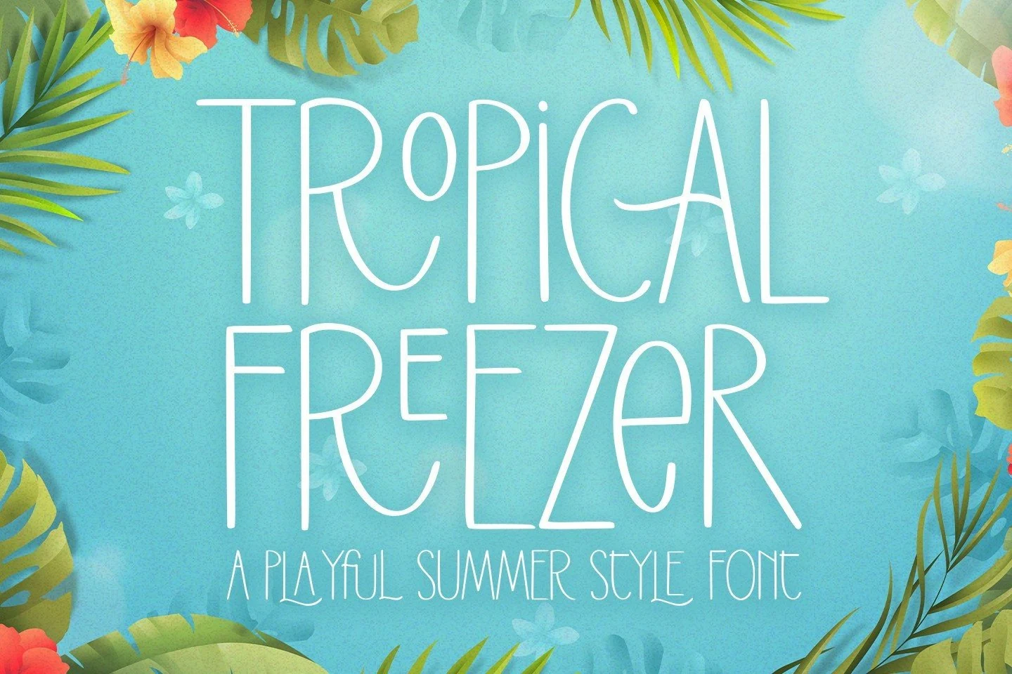
Best For: posters, invitations, social media graphics, playful designs
Tropical Freezer takes a light, airy approach with very tall letterforms, slim strokes, and rounded handwritten curves that feel casual rather than polished. In a sea of Tropical Fonts, it stands out by keeping the mood playful while staying clean enough for readable display work.
Because the letters are narrow and high, this font looks strongest in short titles, packaging callouts, or summery cover text where the vertical rhythm can breathe. A little extra line spacing helps the long strokes stay elegant, and pairing it with a simple solid subheading keeps the layout balanced.
Tropical Culture Font
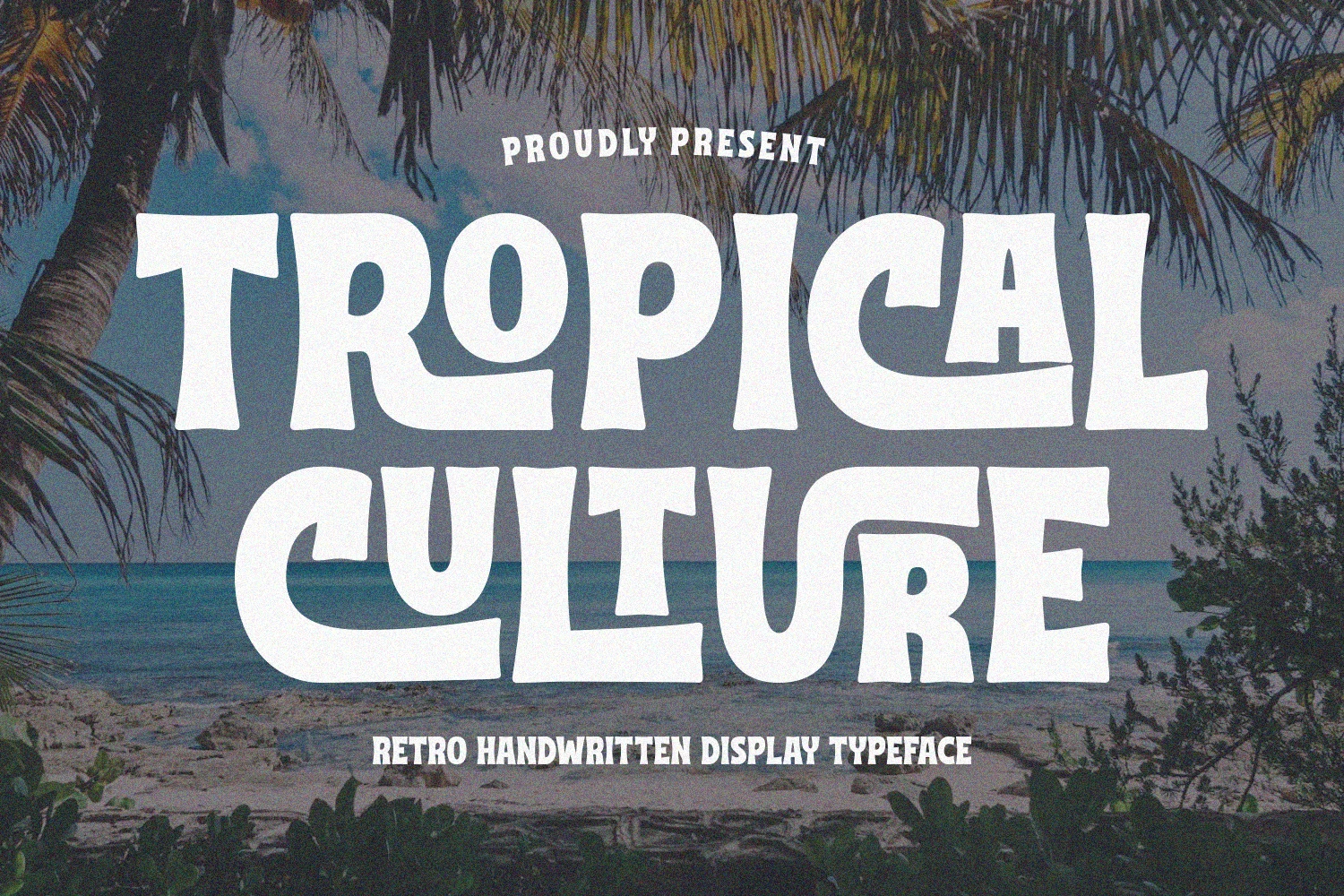
Best For: posters, T-shirts, retro designs, eye-catching designs
Tropical Culture Font leans into a bold retro voice, with chunky strokes, flared curves, and slightly irregular contours that keep the lettering expressive instead of stiff. It gives Tropical Fonts a more nostalgic direction, and the wide silhouettes make each word feel graphic and memorable at a glance.
This is a display face that works best when you let the shapes carry the composition. Use it for short titles or statement text, keep tracking fairly snug, and pair it with a simpler secondary font so the dramatic curves stay in control.
Ritmo Tropical Font
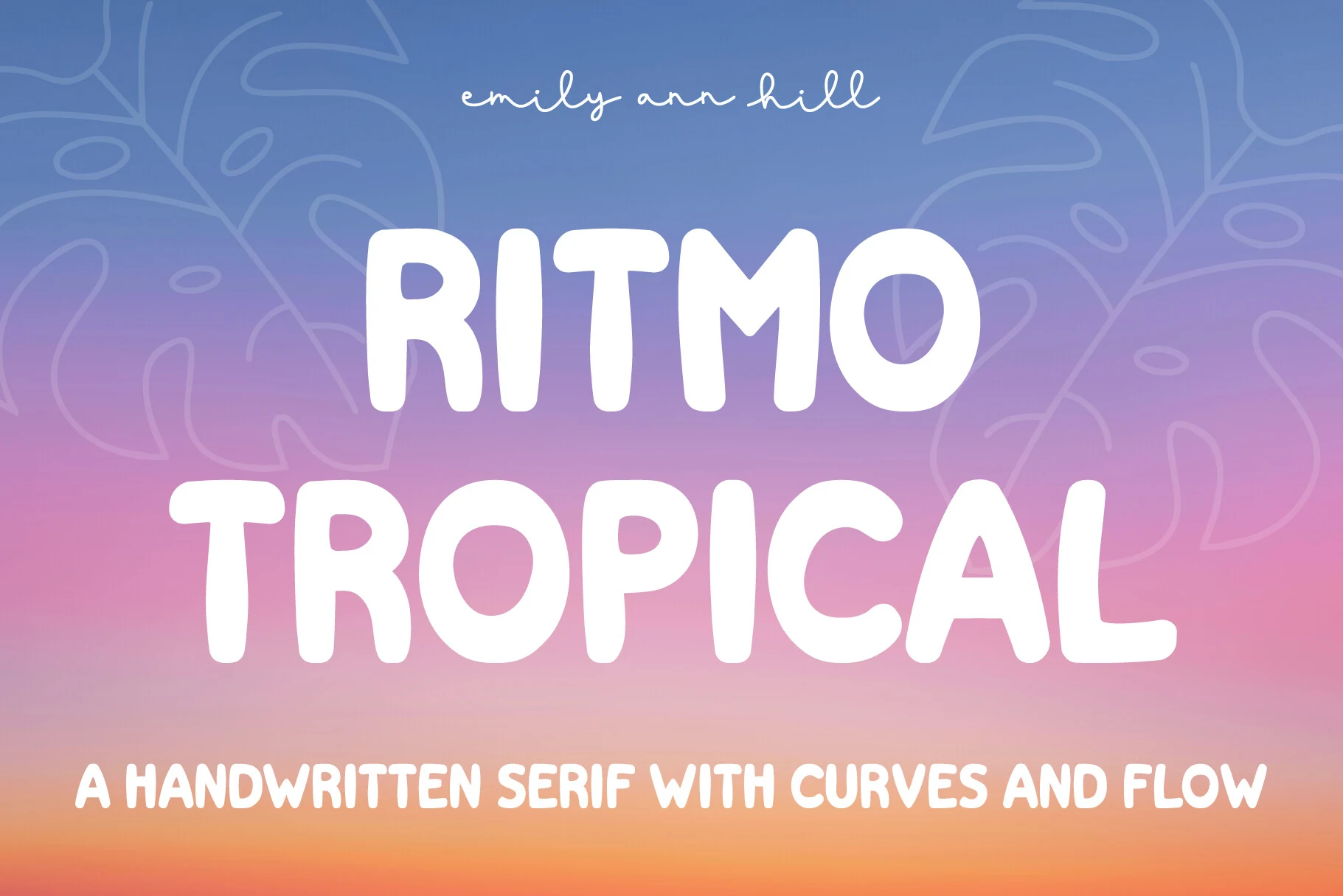
Best For: headlines, packaging, quotes, playful designs
Ritmo Tropical Font uses thick rounded strokes, soft corners, and squat handwritten shapes that give each word a warm, inflated rhythm. It brings a bubbly side to Tropical Fonts without losing clarity, since the counters stay open and the letter widths remain steady enough for quick-reading headlines.
The font suits packaging, pull quotes, and display copy where a friendly title needs weight rather than sharp polish. Keep the spacing moderate: too loose weakens the connected visual mass, while strong contrast against the background helps the rounded forms hold their shape.
Tropical Paradise Font
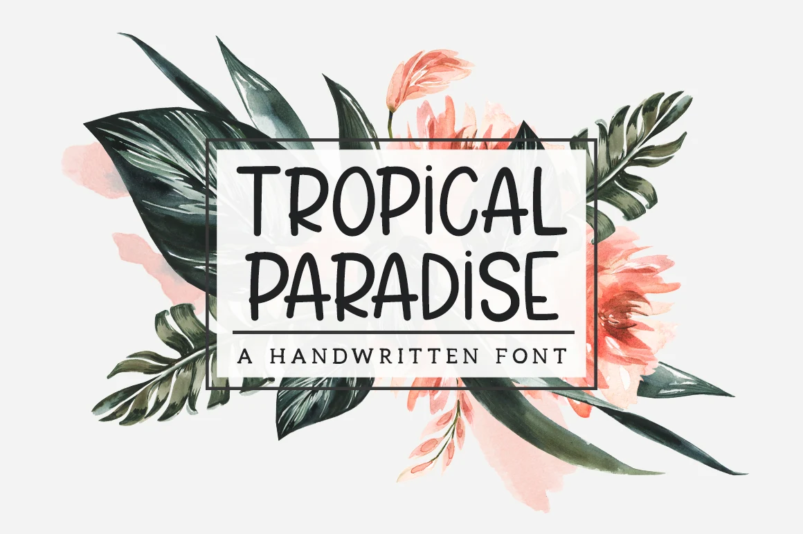
Best For: headlines, website headers, quotes, clean designs
Tropical Paradise Font has a light monoline structure, tall proportions, and rounded handwritten curves that give it a calm, modern rhythm. The small heart accents add charm without distracting from the clean letterforms, which helps Tropical Fonts feel polished and airy instead of overly decorative.
It works best in headings, quote graphics, and branding layouts where the long vertical strokes have room to breathe. Keep the spacing slightly open and pair it with a simpler supporting font to preserve its delicate texture and readable flow at display sizes.
Tropical Organic Font
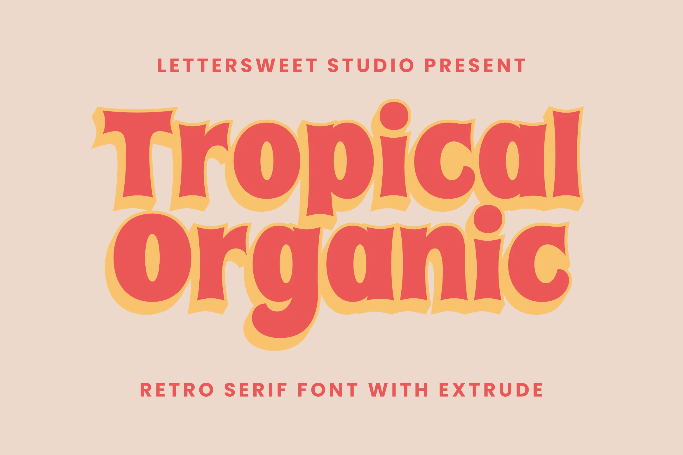
Best For: branding, packaging, posters, retro designs
Tropical Organic Font has a chunky retro serif structure with rounded bowls, flared edges, and slightly wavy contours that keep it feeling hand-drawn rather than rigid. The letterforms have real presence, and the bold silhouette gives Tropical Fonts a warmer, groovier direction with clear vintage energy.
The extrude effect adds depth without making the type hard to read, so it works especially well for short branding statements, poster titles, and punchy packaging. Let it lead the hierarchy, keep supporting text simple, and use solid spacing so the curved shapes and shadowed edges stay crisp.
Beach Lover Tropical Drinks Duo Font
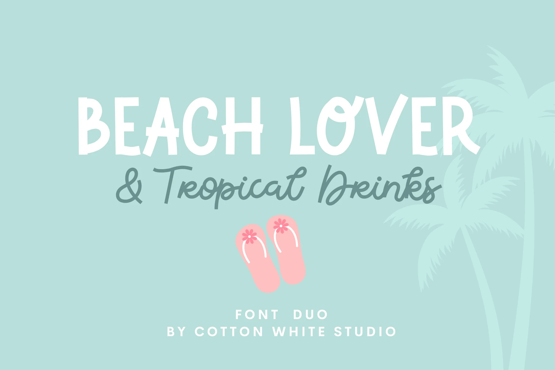
Best For: branding, invitations, social media graphics, playful designs
Beach Lover Tropical Drinks Duo Font pairs two distinct looks: chunky all-caps lettering with slightly uneven handmade edges, and a loose script that feels relaxed and breezy. That contrast gives Tropical Fonts a beachy, lifestyle mood, with the bold style grabbing attention while the cursive line keeps the composition light.
Use the block letters for the main headline, then drop the script into a short subtitle, menu phrase, or brand accent so the hierarchy stays clear. It looks strongest with plenty of breathing room and a simple color palette, which lets the playful contrast between the two styles do the work.
Loku Pokan Font
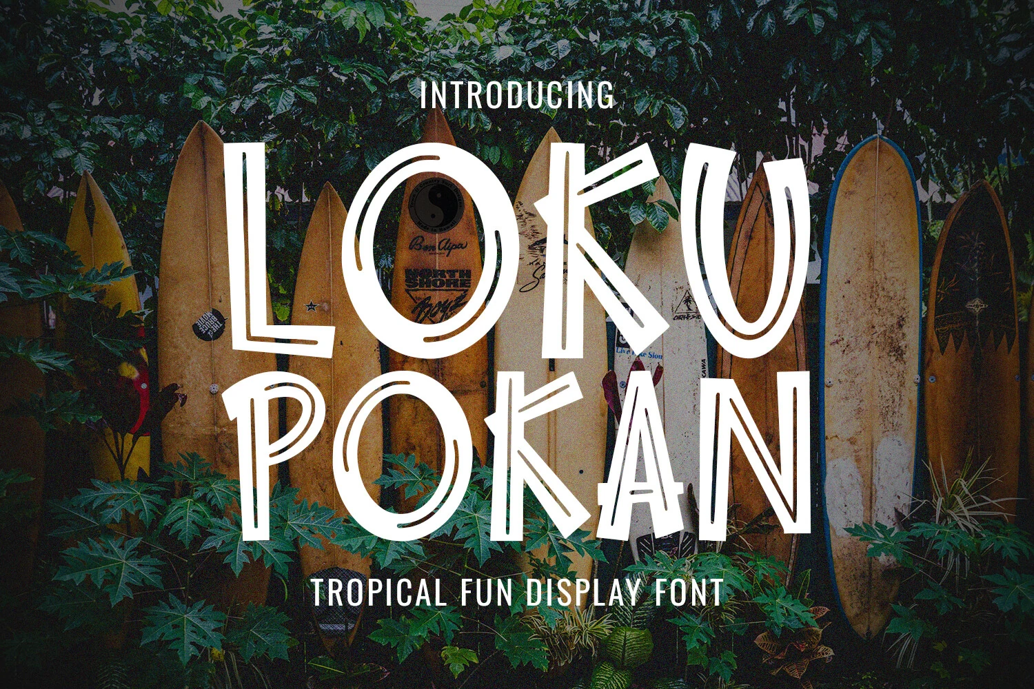
Best For: posters, merch design, stickers, T-shirts
Loku Pokan Font has a loose surf-shop attitude, built from chunky uppercase letters with uneven widths, tilted stems, and carved inline gaps. The rounded O shapes and exaggerated K strokes give it a handmade tropical rhythm without turning the words into messy lettering.
For Tropical Fonts that need impact, this one works best in short display lines where the irregular forms can stay large and legible. Use steady spacing and strong background contrast; the internal cutouts already add movement, so the layout does not need much extra decoration.
Kora Font
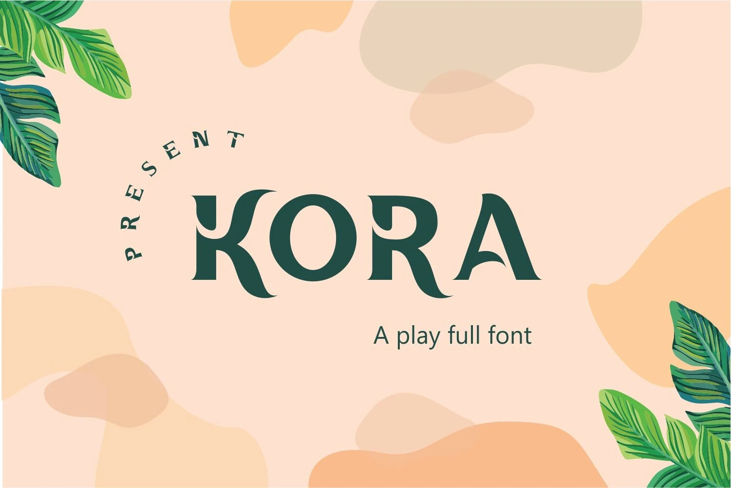
Best For: logos, branding, packaging, product labels
Kora Font blends a tropical mood with a more polished display structure. Its wide serif letters, soft curves, and distinctive broken accent cuts give the lettering a sculpted look, while the sweeping R and stylized A keep it lively rather than formal.
If you are browsing Tropical Fonts with a refined edge, Kora stands out in logos, packaging, and short titles where those decorative cuts stay clear. Keep the wording concise and give it breathing room in the layout; the letterforms already carry the personality, so crowded compositions dull the effect.
Tropical Carnival Font
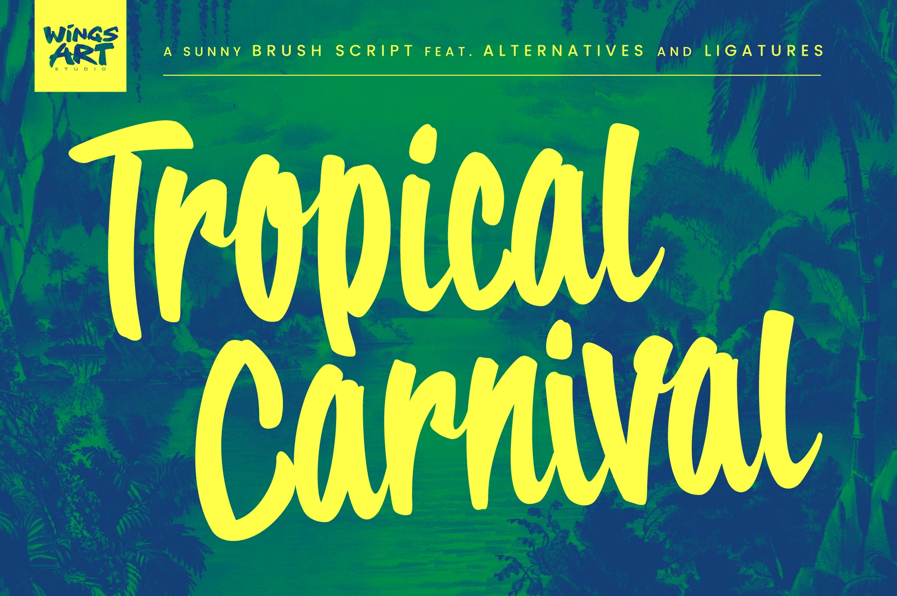
Best For: posters, T-shirts, stickers, social media graphics
Tropical Carnival Font is a chunky brush script with thick rounded strokes, fast curves, and a casual hand-painted bounce. The connected lowercase forms keep the words flowing, while the oversized caps and long descenders make the lettering feel sunny, loud, and built for display.
Use it where Tropical Fonts need a relaxed vacation voice rather than a clean resort look. It works best in short phrases with generous line height; the broad brush shapes need strong contrast and enough scale so the joins, loops, and uneven stroke edges stay readable.
Tropical Sunshine Font
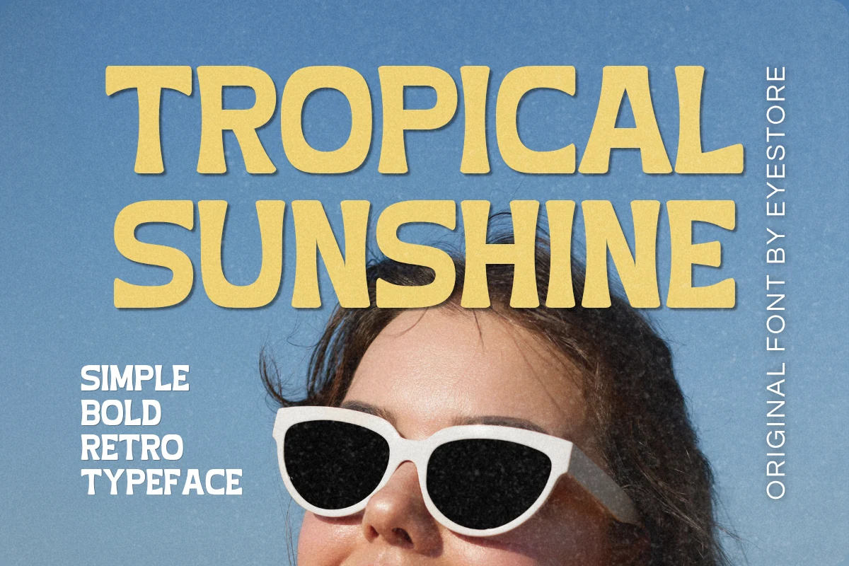
Best For: posters, T-shirts, quotes, branding
Tropical Sunshine Font leans into a bold retro look with broad uppercase letters, soft rounded corners, and sturdy shapes that read instantly. The even weight keeps it clean, while the slightly bouncy proportions give it that cheerful beach-era energy without feeling overly decorative.
When you want Tropical Fonts that stay simple and punchy, this one is strongest in short headlines, product graphics, and stacked quote layouts. It holds up well at medium to large sizes, and the thick forms pair best with open spacing and uncluttered backgrounds so the vintage mood stays crisp.
Bristol Font
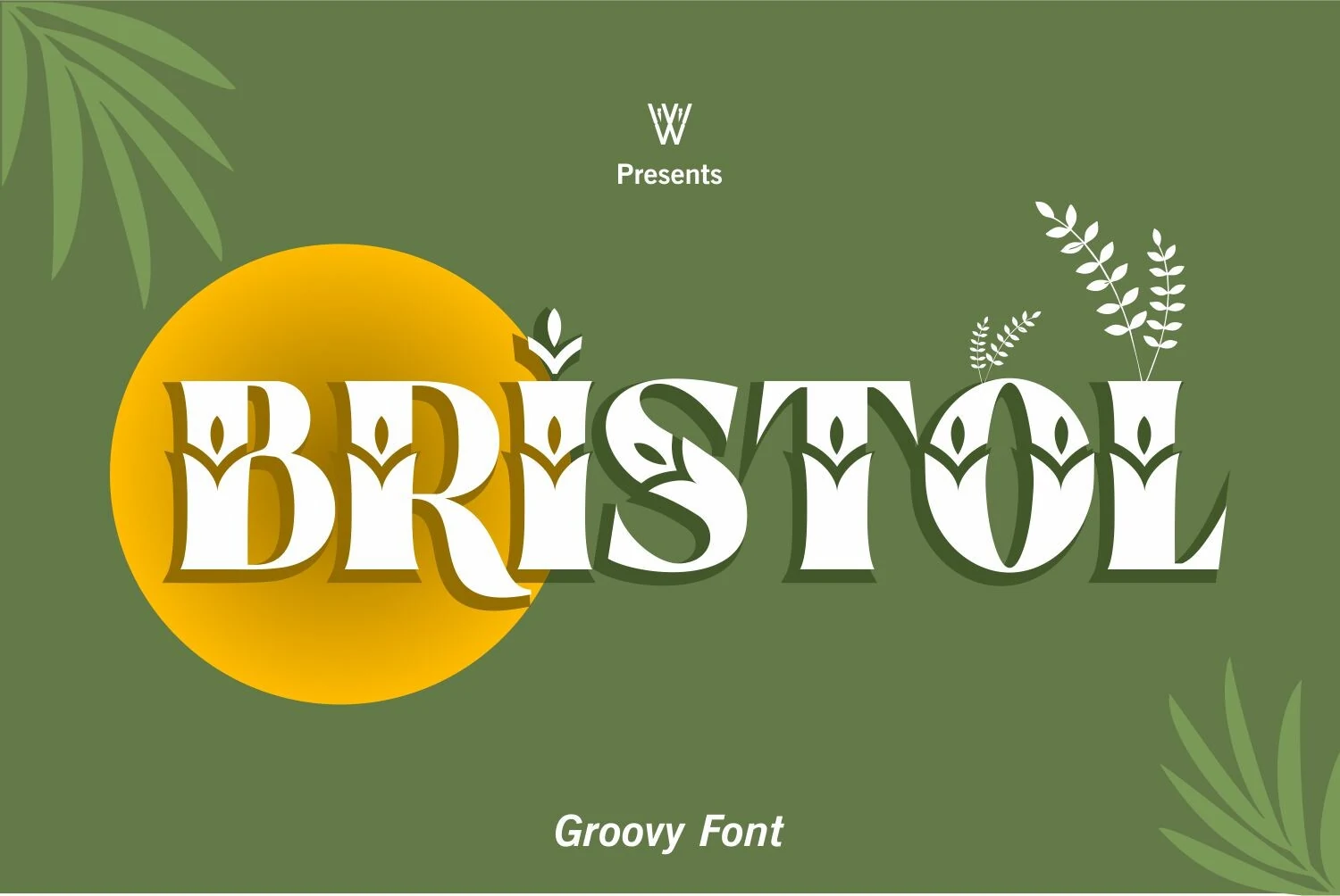
Best For: logos, branding, packaging, posters
Bristol Font brings a more ornamental side to Tropical Fonts, mixing bold serif proportions with carved leaf-like cuts and sweeping curves. The sturdy verticals make it feel confident, while details like the curled leg of the R and the decorative counters add a botanical rhythm.
This is a display-first face, so it shines in short titles, logo-style words, and packaging where the letterforms can stay large. Give it a little breathing room and pair it with a plain secondary font; that contrast keeps the decorative shapes crisp instead of visually crowded.
Tropical Asian Font
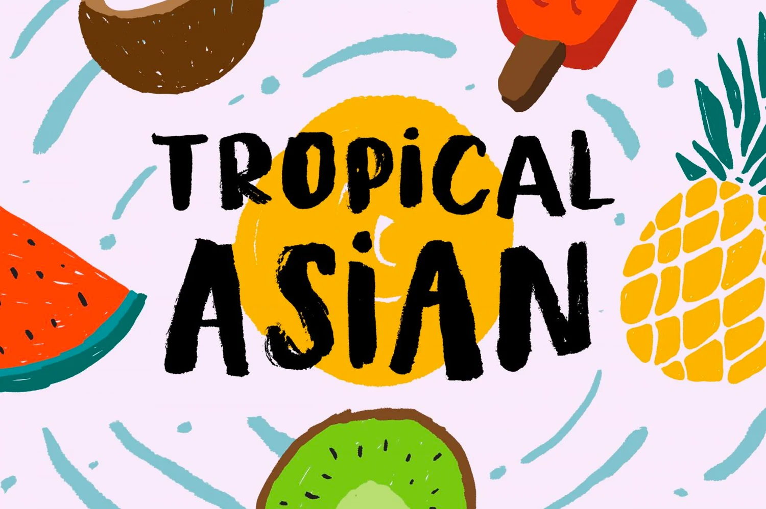
Best For: posters, stickers, T-shirts, fun designs
Tropical Asian Font is a rough brush display face with heavy black strokes, uneven uppercase shapes, and dry textured edges. The letters feel painted quickly rather than polished, with narrow counters and slightly wobbly stems that give short words a handmade, high-energy rhythm.
For Tropical Fonts that need a loud casual feel, this one suits fruit-themed posters, stickers, and summer merch better than long copy. Keep the phrase short, raise the size, and use strong color contrast so the brush texture reads as intentional movement instead of visual noise.
Tropical Punch Font
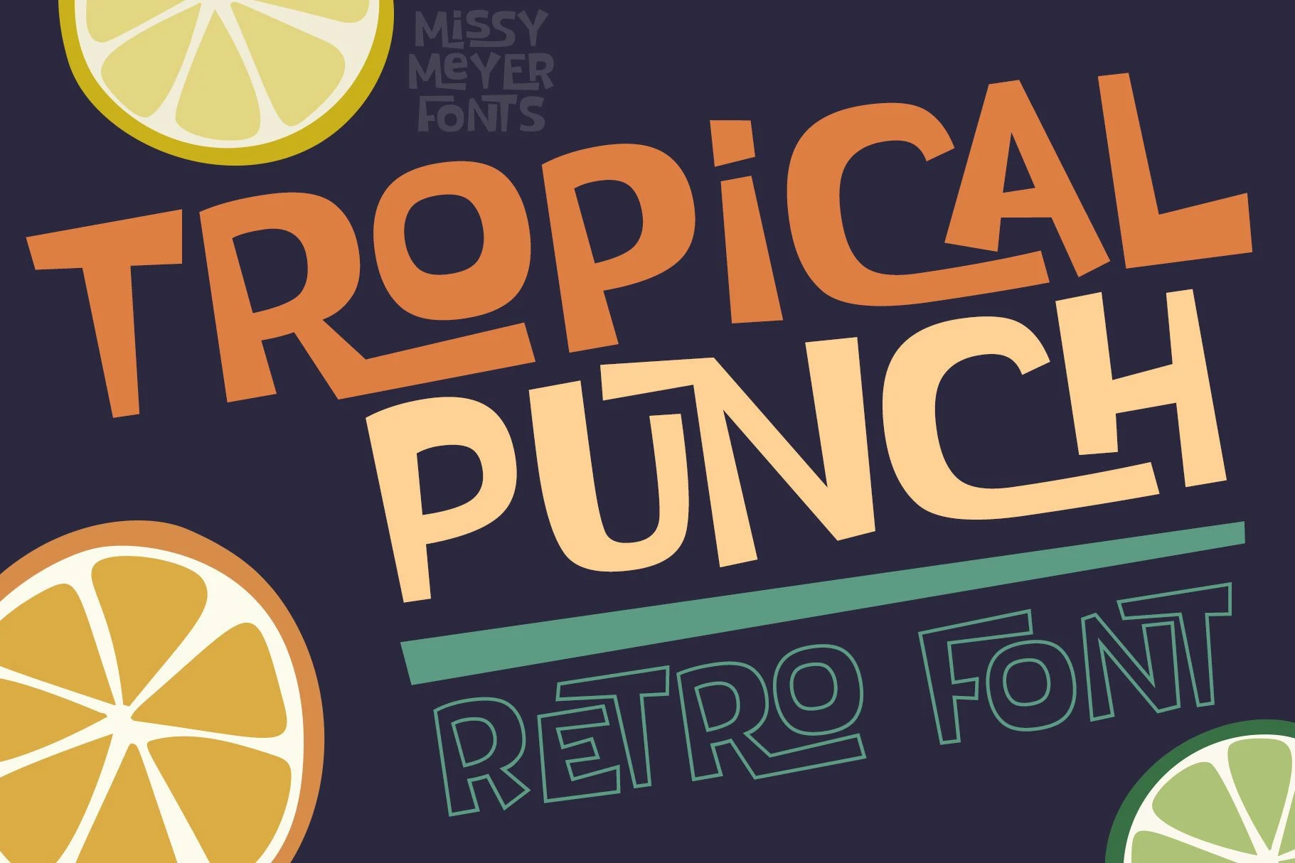
Best For: posters, branding, social media graphics, website headers
Tropical Punch Font has a bold retro stance, built from broad uppercase letters, quirky cuts, and a lively slanted layout. The shapes feel simple at first glance, but details like the angled R leg and the alternate outlined treatment give it a playful poster energy.
If your Tropical Fonts lineup needs something louder, this one works especially well in short stacked headlines where the oversized forms can stay clear. Keep the surrounding text restrained and leave generous margins, because the tilted rhythm already adds movement without extra decoration.
Tropical Paradise Font
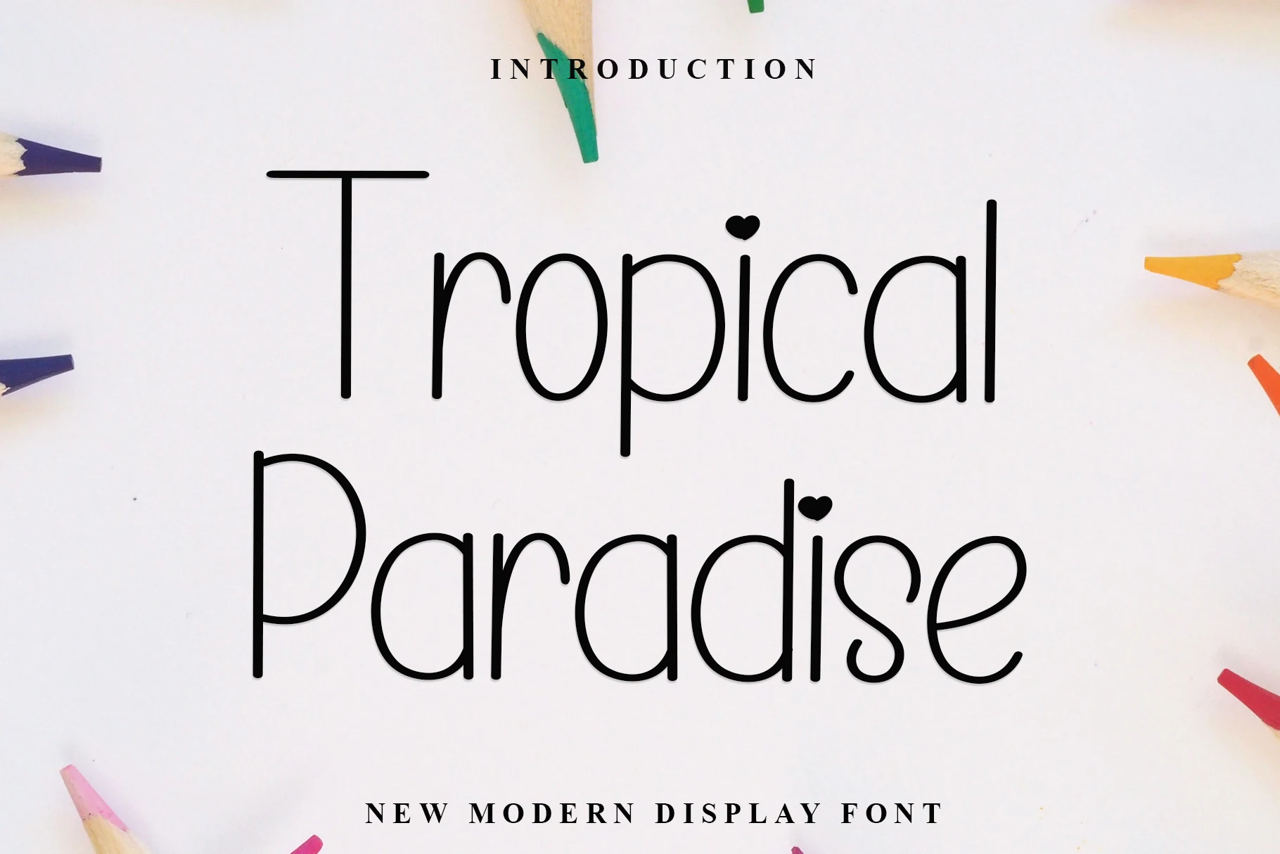
Best For: quotes, invitations, social media graphics, soft designs
Tropical Paradise Font has a clean handwritten look with thin monoline strokes, tall rounded letters, and a soft contemporary rhythm. The long crossbar on the T gives the opening word a light display feel, while the small heart details add a sweet accent without making the lettering heavy.
This is one of the gentler Tropical Fonts in the group, better suited to quotes, invitations, and relaxed social graphics than loud beach posters. Keep contrast high and avoid tight tracking; the narrow strokes need space around them so the rounded forms stay clear and readable.
Butter Tropical Font
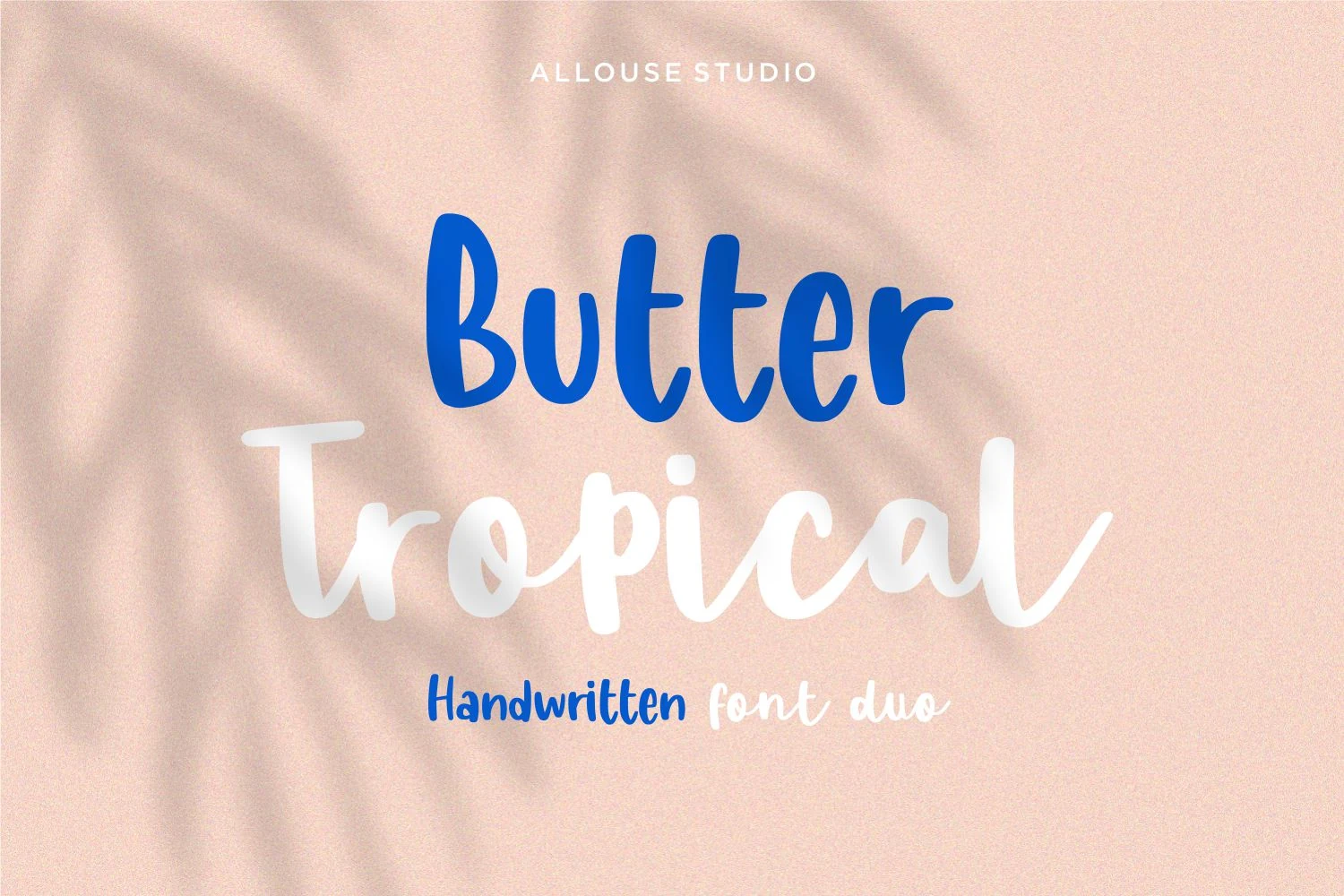
Best For: social media graphics, invitations, quotes, cute designs
Butter Tropical Font has a light, friendly personality built around two contrasting handwritten looks. The rounded upright lettering feels plump and cheerful, while the smoother script adds a softer rhythm, giving headings a casual layered feel without becoming messy.
For Tropical Fonts with a cute, easygoing tone, this one works nicely in short quotes, social posts, and invitation-style layouts. Use the thicker style for the main words and the looser script as an accent; that small hierarchy shift keeps the composition playful but still readable.
This collection works best for designs that need a clear tropical mood without relying only on palm leaves or beach imagery. Choose chunky retro fonts like Tropical Culture, Tropical Organic, Tropical Punch, or Tropical Sunshine when the headline needs weight and instant visibility. Use brush and handwritten styles such as Tropical Carnival, Butter Tropical, or Tropical Paradise for softer quotes, invitations, and casual social posts. For branding and packaging with a more polished edge, Kora and Bristol are stronger choices. The safest approach is simple: use the loud display fonts for posters and merch, and the lighter handwritten fonts for relaxed, friendly layouts.