18 Best Gothic Halloween Fonts for Halloween Designs in 2026
Gothic Halloween Fonts span tightly compressed blackletter, rough dripping treatments, and ornate high-contrast serif designs. This collection focuses on how visible construction affects mood, readability, and practical use across posters, apparel, logos, book covers, invitations, and other large-format Halloween work.
Looking for more halloween fonts? Browse our complete Halloween Fonts collection to compare vintage, cute, scary, spooky, and creepy halloween styles.
Gothic Halloween Fonts: Sharp Blackletter
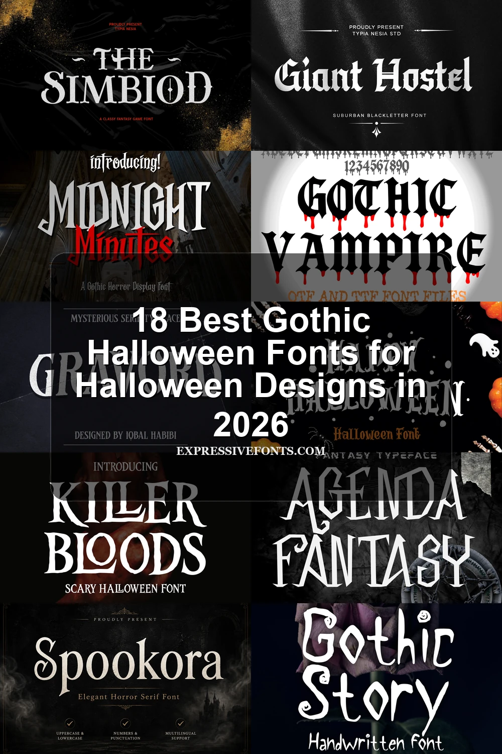
Gothic Halloween Fonts in this group use condensed proportions, heavy vertical stems, sharp terminals, and strong contrast to create recognizable blackletter silhouettes. They are narrower and more structurally formal than the distressed styles.
Northern Font
Best For: logos, branding, posters, T-shirts
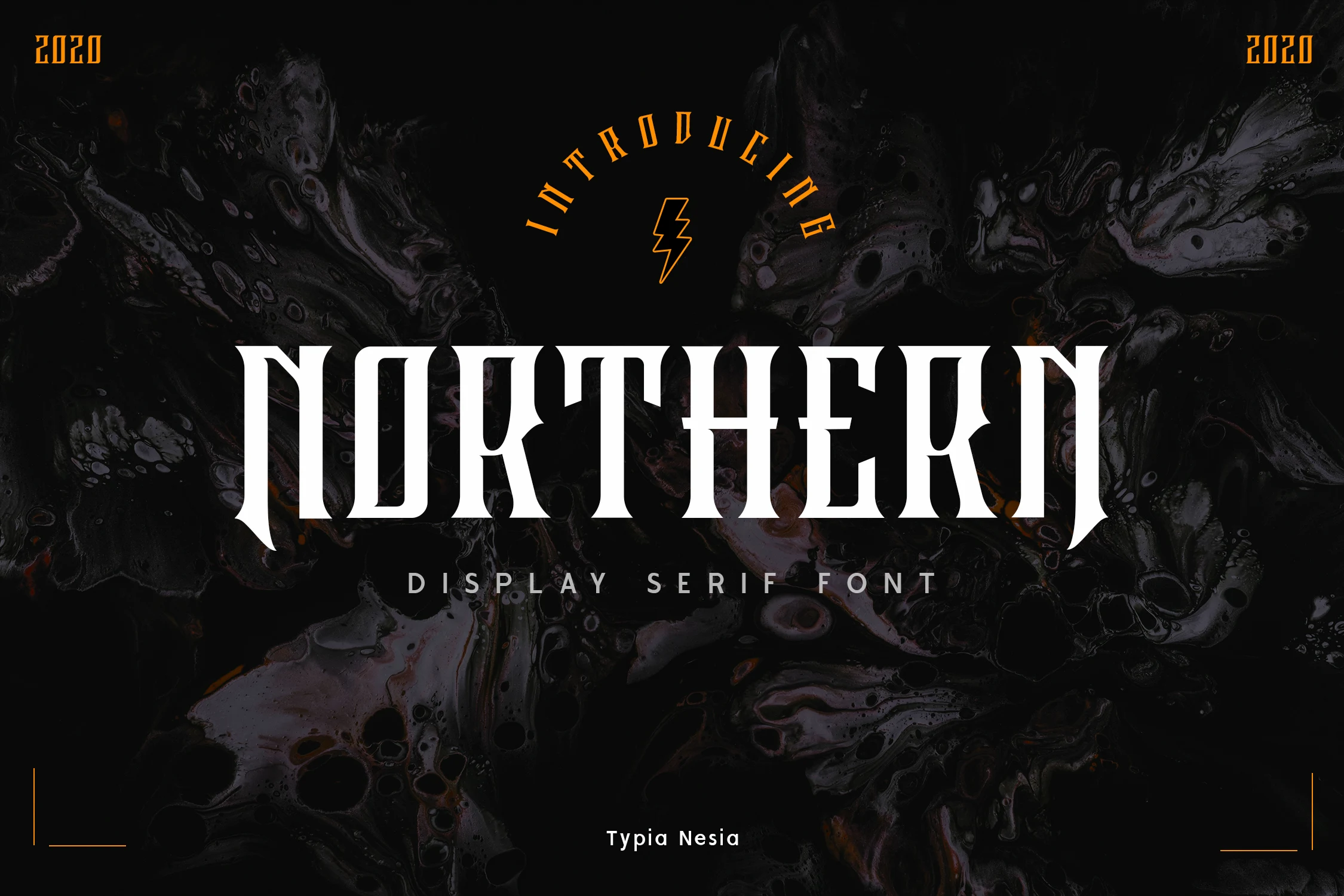
Northern Font gives Gothic Halloween Fonts a tall, narrow blackletter silhouette, pairing heavy vertical stems with thin crossbars, triangular serifs, and jagged terminals. Its condensed width helps logos and shirt graphics occupy less horizontal space, while the angular forms make long text and small settings difficult to read.
Nocturne Black Font
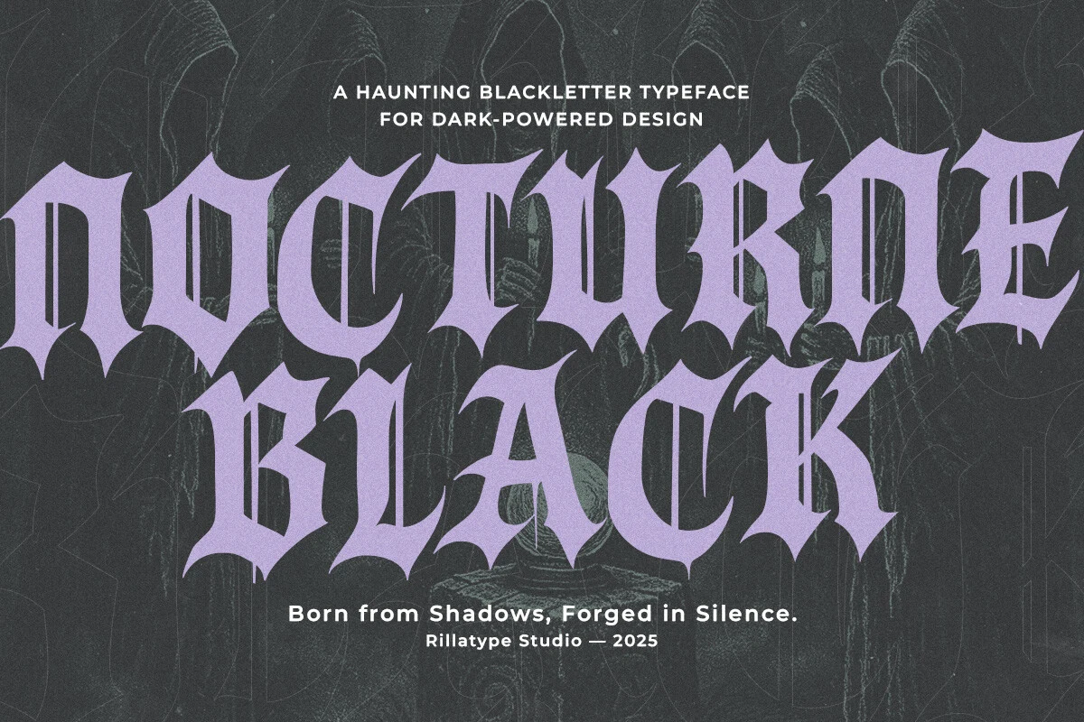
Best For: posters, display text, headlines, invitations
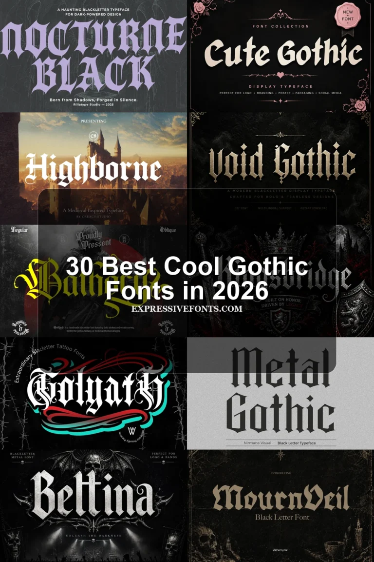
Nocturne Black Font stands out among these Gothic Halloween Fonts with four treatments: Regular, Slanted, Inked, and Inked Slant. The sharp compressed base suits large headlines, while the Inked versions add expressive hand-drawn texture. They provide stylistic variation, not improved small-size clarity.
Cagloria Font
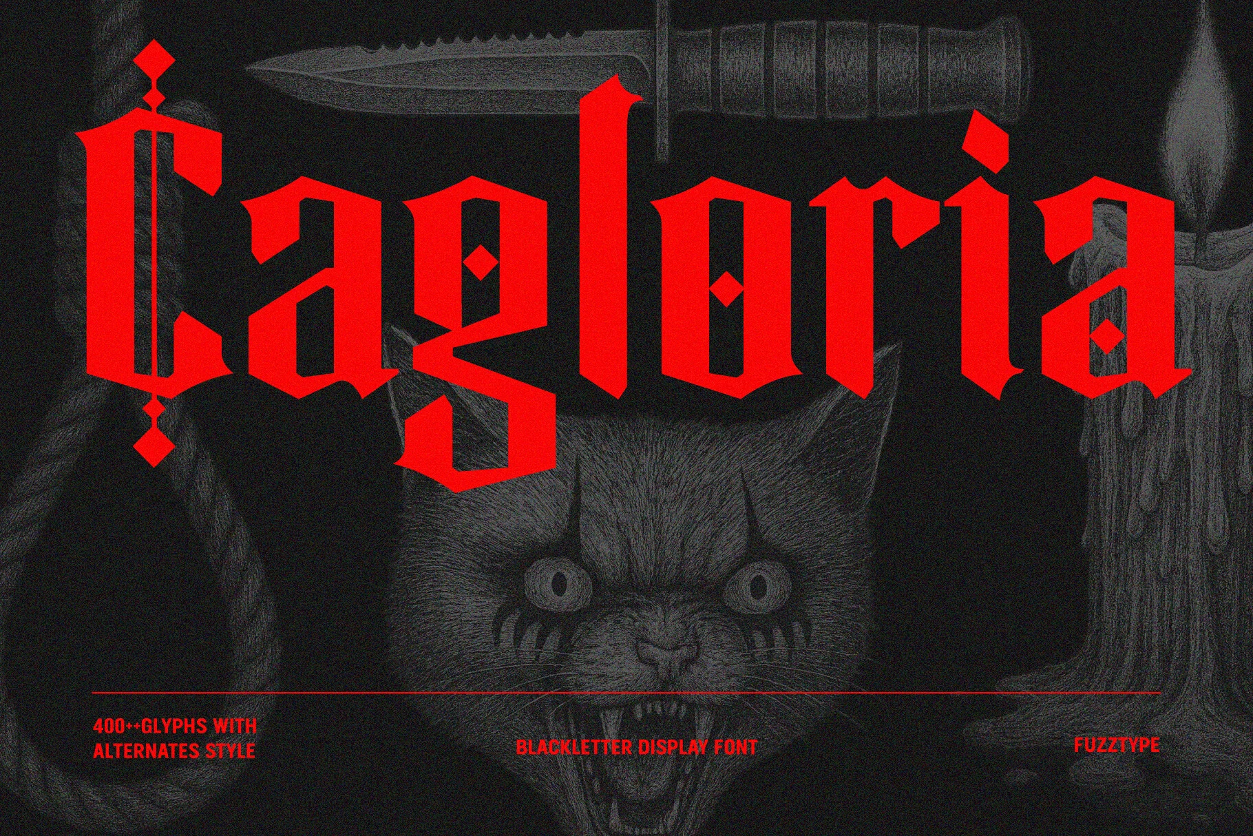
Best For: logos, posters, merch design, display text
Cagloria Font combines compressed blackletter forms with diamond accents, pointed terminals, and high contrast, giving Gothic Halloween Fonts a more customizable logo and cover presence. Its 400-plus glyphs and alternate styles support varied treatments for posters and merchandise, although the decorative complexity still calls for display scale.
Gold and After Font
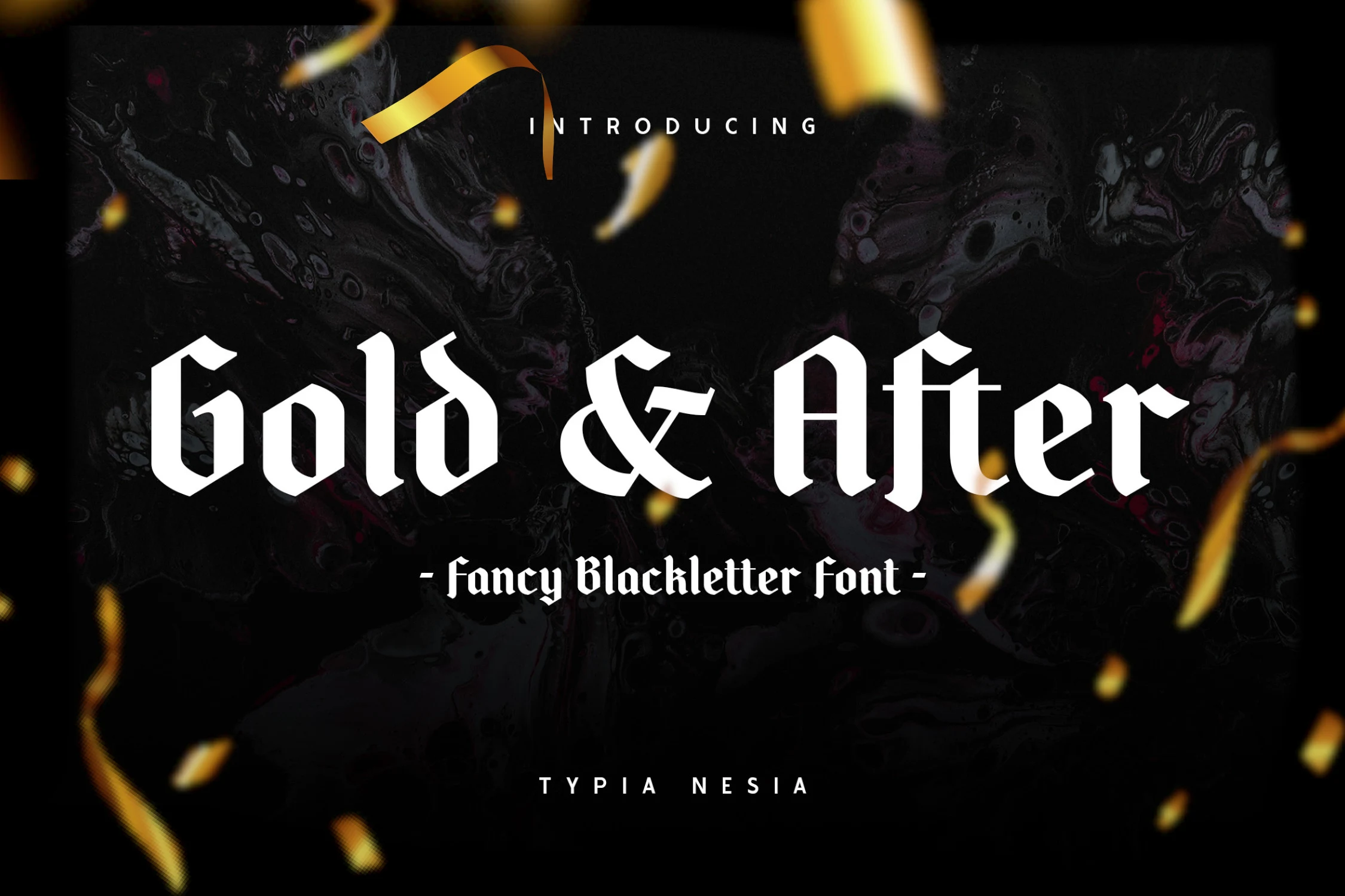
Best For: display text, headlines, posters, vintage designs
Gold and After Font uses narrow Gothic Halloween Fonts proportions, vertical strokes, pointed terminals, and pronounced weight changes to suggest a historical blackletter impression. The condensed structure saves space in headlines and poster titles, yet its angular forms lose legibility quickly when reduced or used for longer wording.
Giant Hostel Font
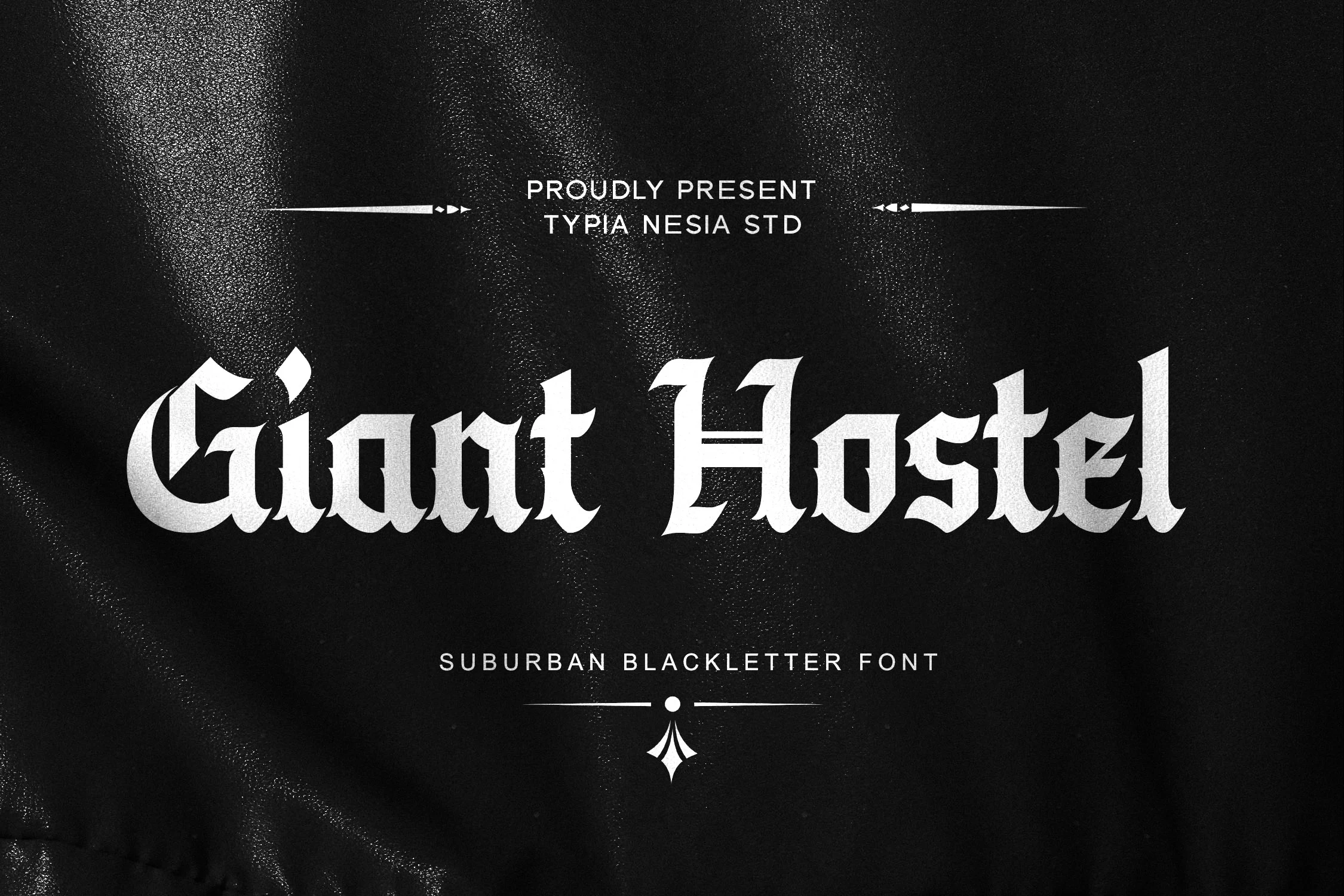
Best For: logos, posters, book covers, display text
Giant Hostel Font gives Gothic Halloween Fonts a fractured silhouette through broken-line construction, spiked terminals, high contrast, and compressed proportions. Its strong logo and cover presence extends naturally to posters, animation, and film work, but the separated angular forms need headline scale for dependable recognition.
Midnight Minutes Font
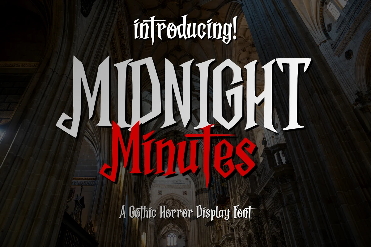
Best For: posters, display text, headlines, signage
Midnight Minutes Font closes the blackletter group with dagger-like terminals, concentrated vertical emphasis, and a condensed upright structure. Among Gothic Halloween Fonts, it is well suited to theatrical posters, headlines, and signage where large sizing lets the sharp forms read clearly; small passages are unsuitable.
Distressed and Dripping Horror
These designs build horror through rough edges, broken alignment, jagged outlines, hand-drawn texture, or visible drips. Their surface effects feel less controlled than blackletter and usually demand larger display sizing.
Agenda Fantasy Font
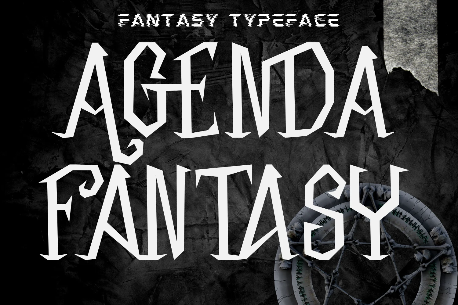
Best For: posters, display text, headlines, T-shirts
Agenda Fantasy Font pushes Gothic Halloween Fonts toward an aggressive occult look through sharp vertices, pointed apexes, disconnected letters, and uneven proportions. The distorted geometry is eye-catching on posters, T-shirts, and other headline treatments, but its irregular construction is a poor fit for compact text blocks or small captions.
Gothic Story Font
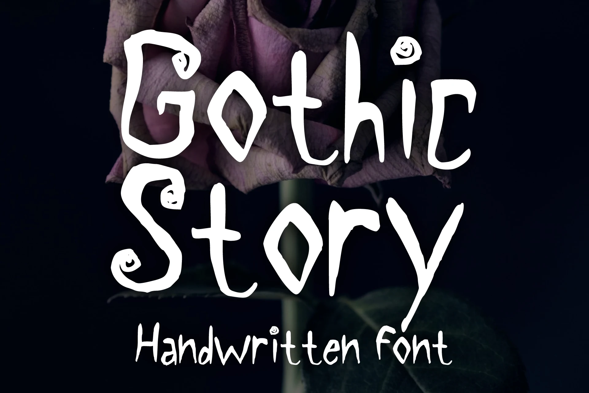
Best For: T-shirts, book covers, stickers, posters
For shirts, stickers, and book covers, Gothic Story Font brings a hand-drawn Gothic Halloween Fonts character rather than a severe blackletter effect. Shaky monoline strokes, curly flourishes, disconnected letters, and an irregular baseline create a kid-friendly 90s horror-film mood. The same looseness, however, makes extended reading tiring.
Gothic Horror Font
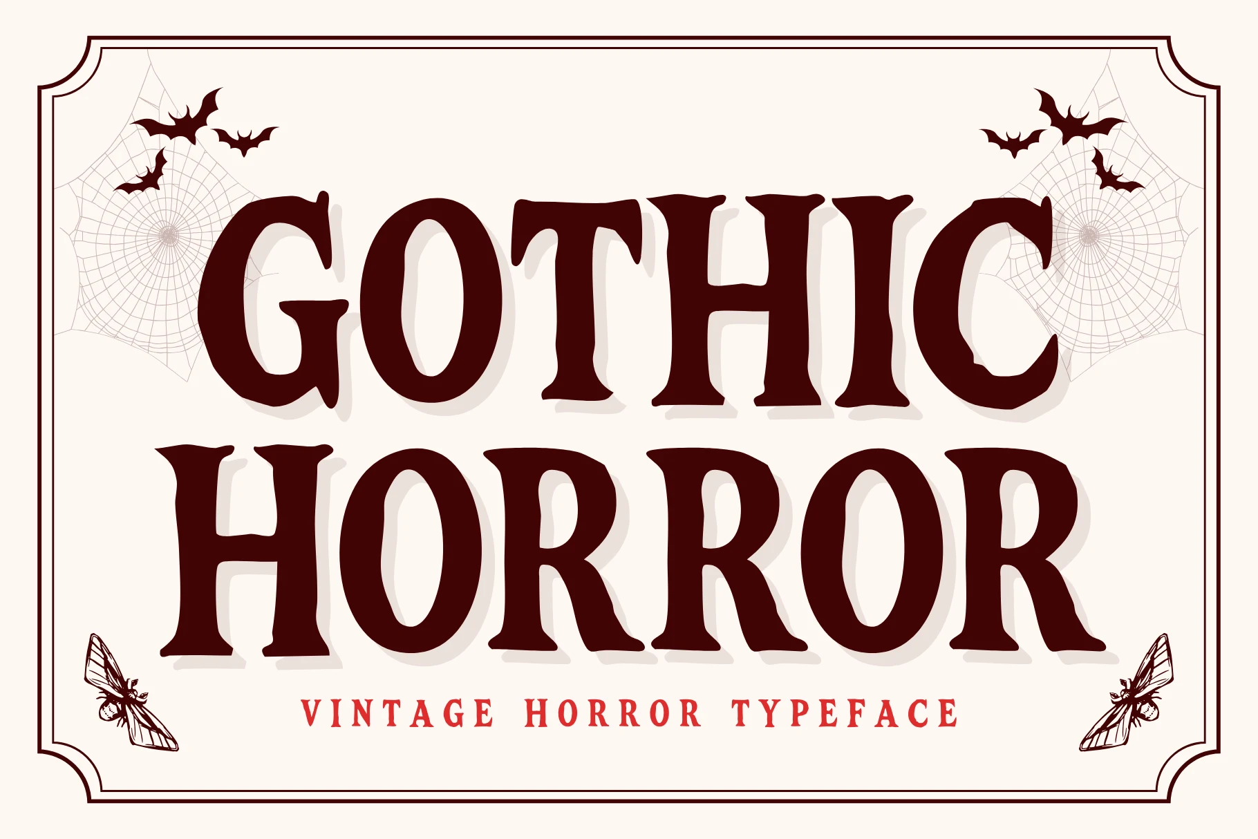
Best For: posters, headlines, display text, T-shirts
Gothic Horror Font translates vintage horror-film texture into Gothic Halloween Fonts with thick blocky serifs, roughened edges, and a jagged distressed outline. The solid core remains readable in large headlines for posters and shirts, but damaged edges can muddy counters and boundaries when the design is reduced.
Killer Bloods Font by Dreamink 7ntypes Font
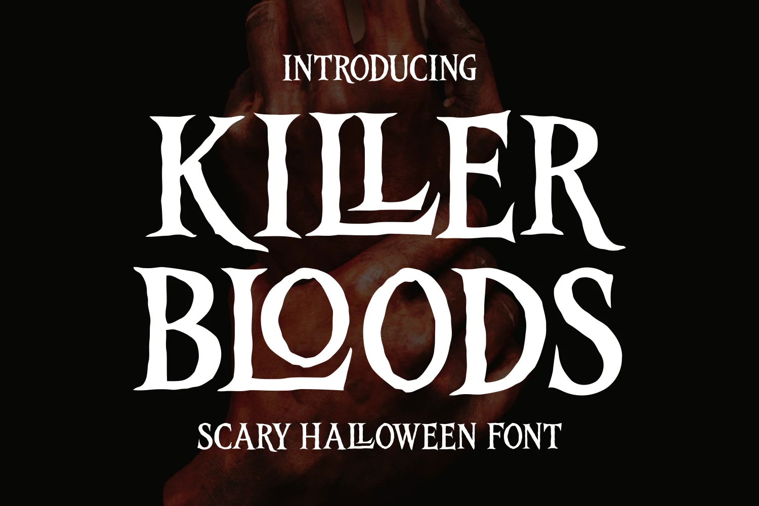
Best For: posters, display text, headlines, quotes
Killer Bloods Font by Dreamink 7ntypes Font roughens the Gothic Halloween Fonts outline with raw hand-drawn edges, jagged contours, condensed proportions, and strong thick-thin contrast. It gives quotes and posters immediate horror texture, but the uneven strokes can reduce letter recognition when scaled down.
Happy Halloween 1 Font
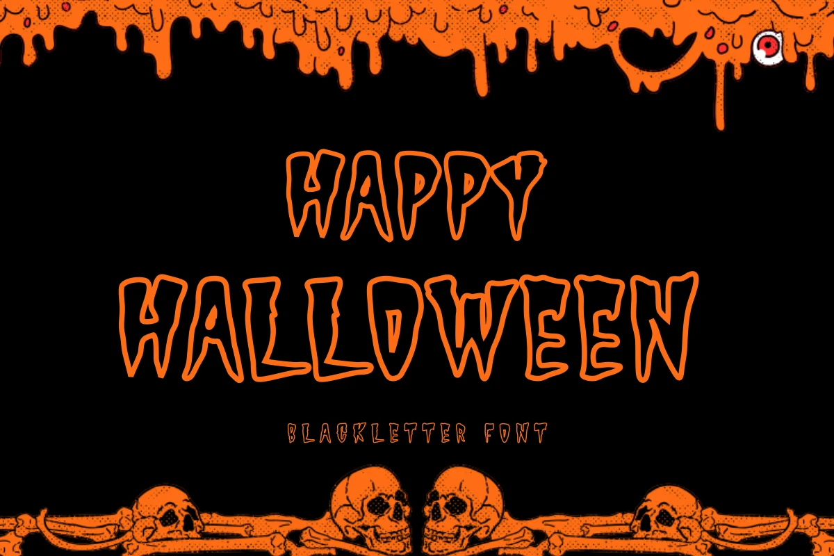
Best For: headlines, posters, display text, T-shirts
Happy Halloween 1 Font turns Gothic Halloween Fonts into an unrefined dripping treatment through uneven alignment, jagged edges, and strokes that visibly extend from the letters. The modern blackletter base works for short poster headlines and shirts, while dense wording becomes harder to parse as the effect accumulates.
Gothic Vampire Font
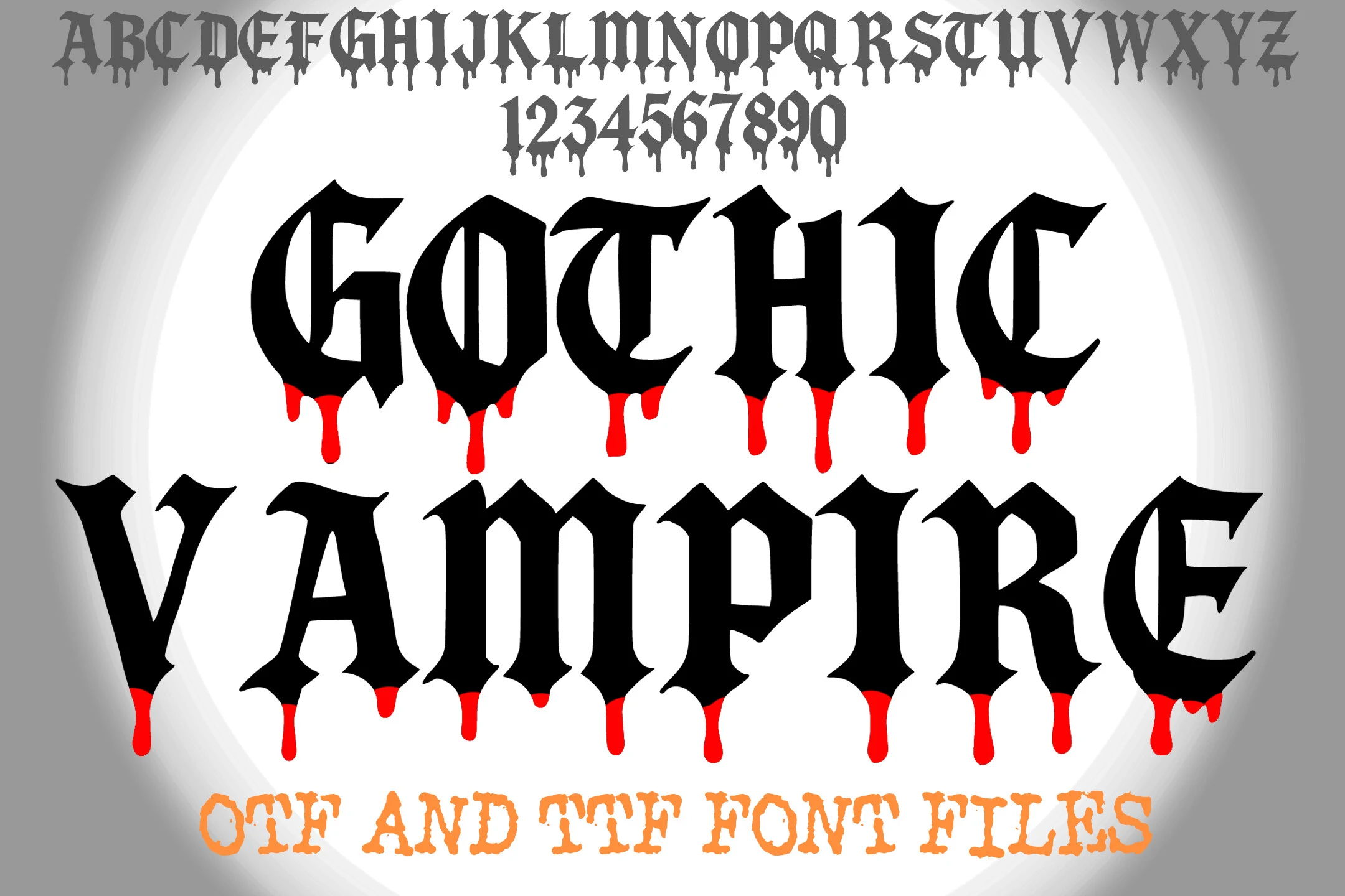
Best For: posters, display text, invitations, T-shirts
Gothic Vampire Font signals vampire horror through heavy vertical strokes, pointed serifs, and visible drips extending from the letterforms. This Gothic Halloween Fonts option fits large posters, invitations, and apparel, and its OTF and TTF formats support common production workflows. Small text remains a weak use.
Ornate High-Contrast Serifs
Ornate serifs, pointed terminals, internal details, and high thick-thin contrast define this group. Compared with the other categories, these faces offer more formal title structures while retaining a sinister Halloween character.
Gravord Font
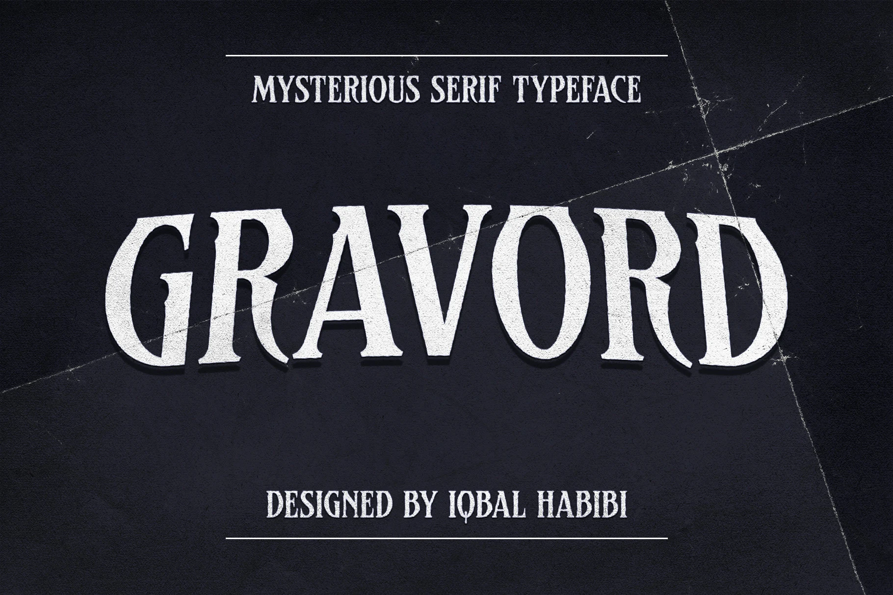
Best For: posters, merch design, packaging, headlines
Gravord Font uses flared, pointed serifs, tapered terminals, and high thick-thin contrast for a cinematic Gothic Halloween Fonts title style. Its all-caps forms stay clear in large headlines, making it effective for horror posters, packaging, and rock merchandise, but the terminals need generous scale.
Rockmosh Font
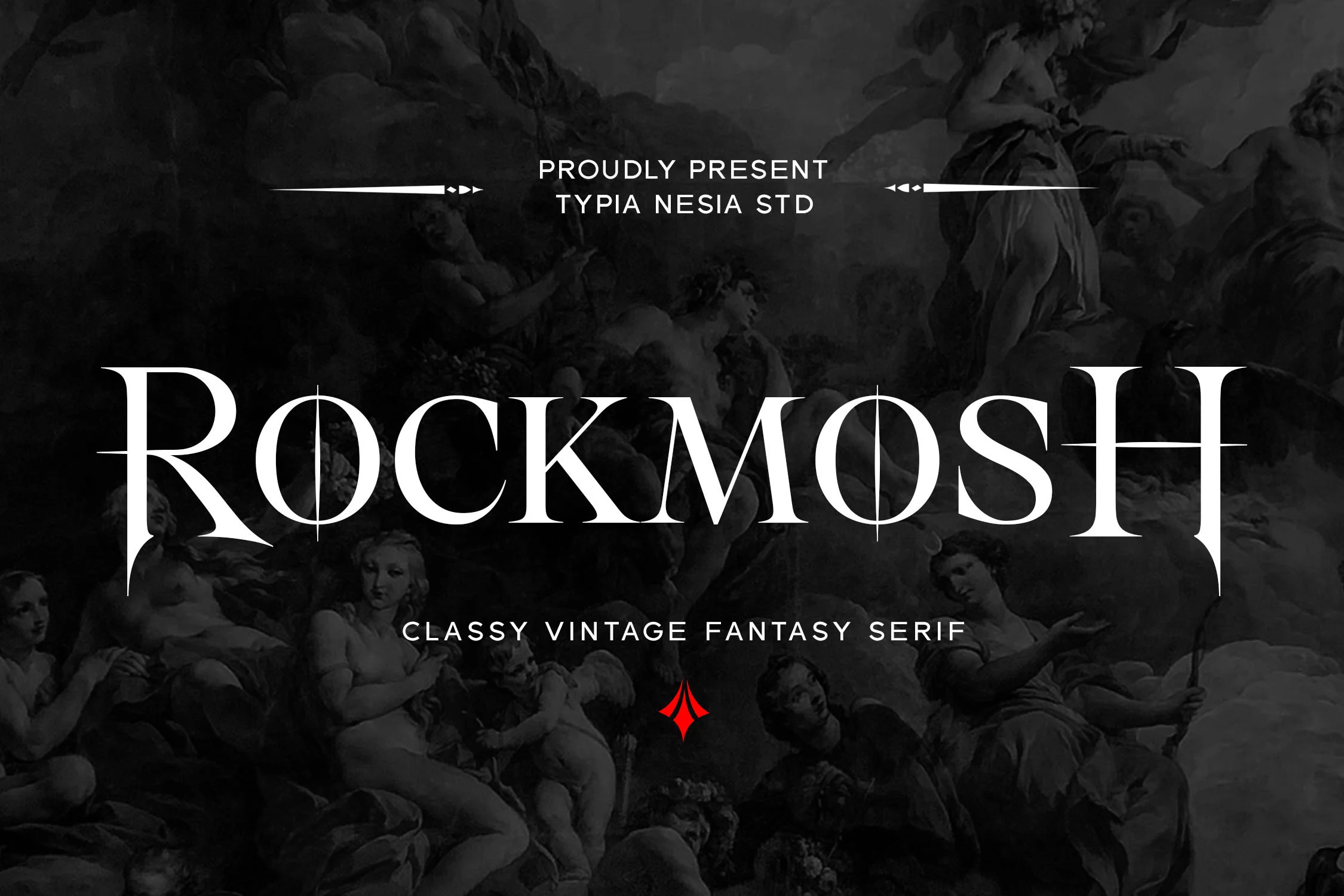
Best For: logos, branding, posters, display text
Rockmosh Font gives Gothic Halloween Fonts a wide, ornate structure through horizontal bars crossing the letters, elongated pointed serifs, and decorative terminal spikes. Its broad footprint and dense detail make it stronger for logos, posters, and apparel than confined text, where the high contrast can become crowded.
Aestura Font
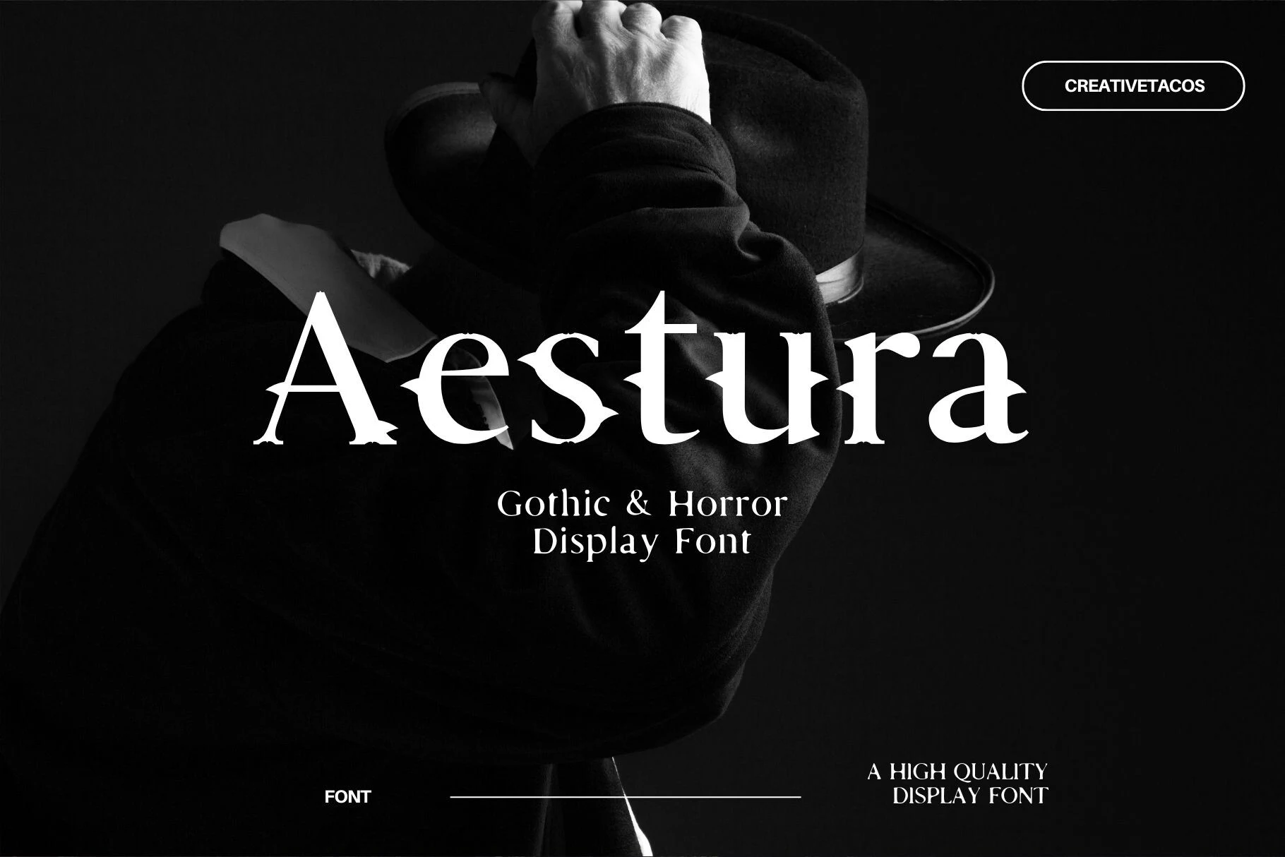
Best For: posters, book covers, display text, headlines
Aestura Font shapes Gothic Halloween Fonts through upright vertical forms, spiked terminals, and a clean high-contrast serif construction. Its regular width gives posters and book covers more breathing room than condensed blackletters, but the sharp details remain most legible in large titles rather than smaller supporting copy.
The Simbiod Font
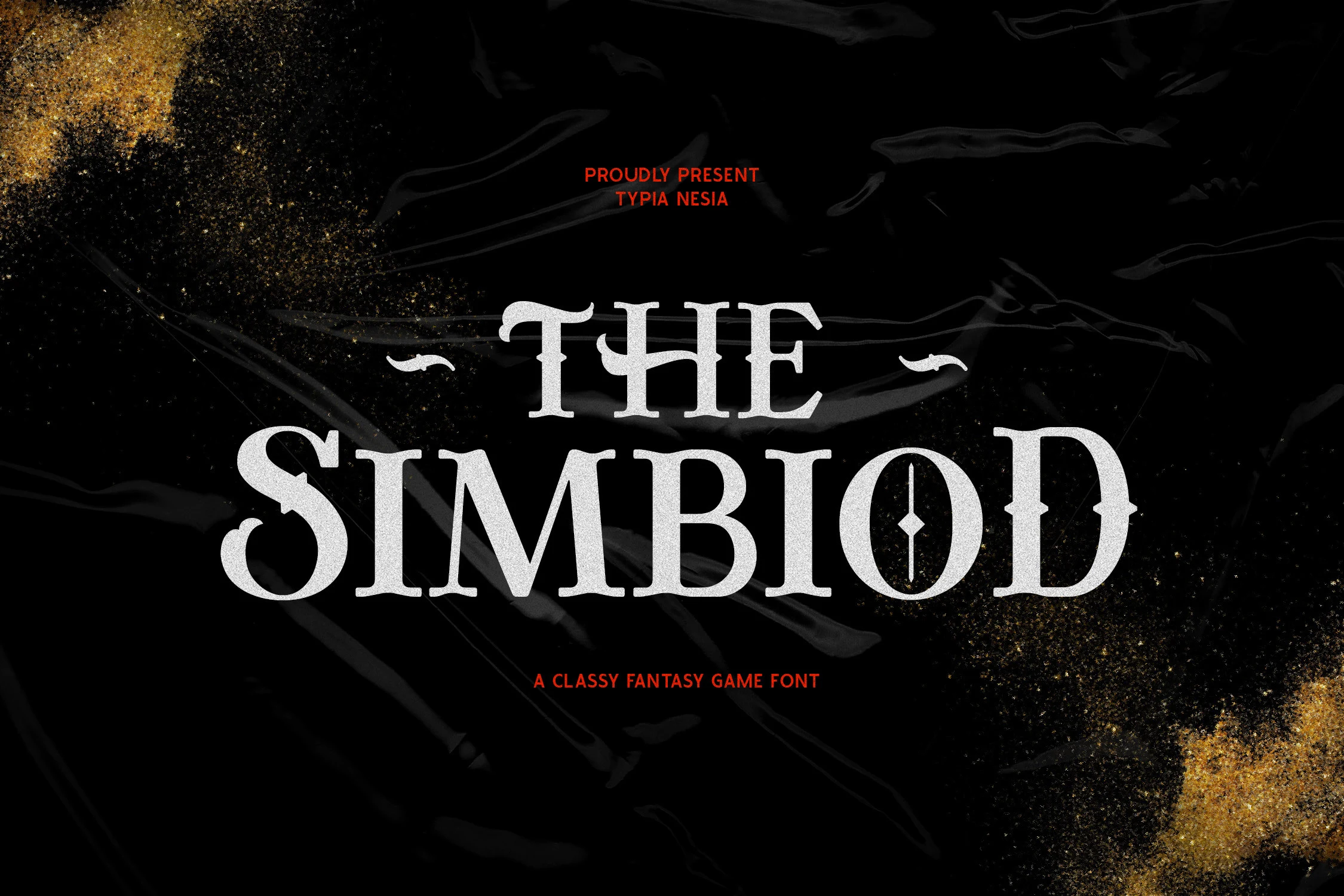
Best For: logos, branding, posters, book covers
For fantasy titles and logos, The Simbiod Font gives Gothic Halloween Fonts a formal display-serif foundation with sharp triangular serifs and an ornamental vertical stroke inside the uppercase O. That internal detail creates a theatrical focal point, but it needs generous sizing so the ornament does not compromise recognition.
Halloween Font
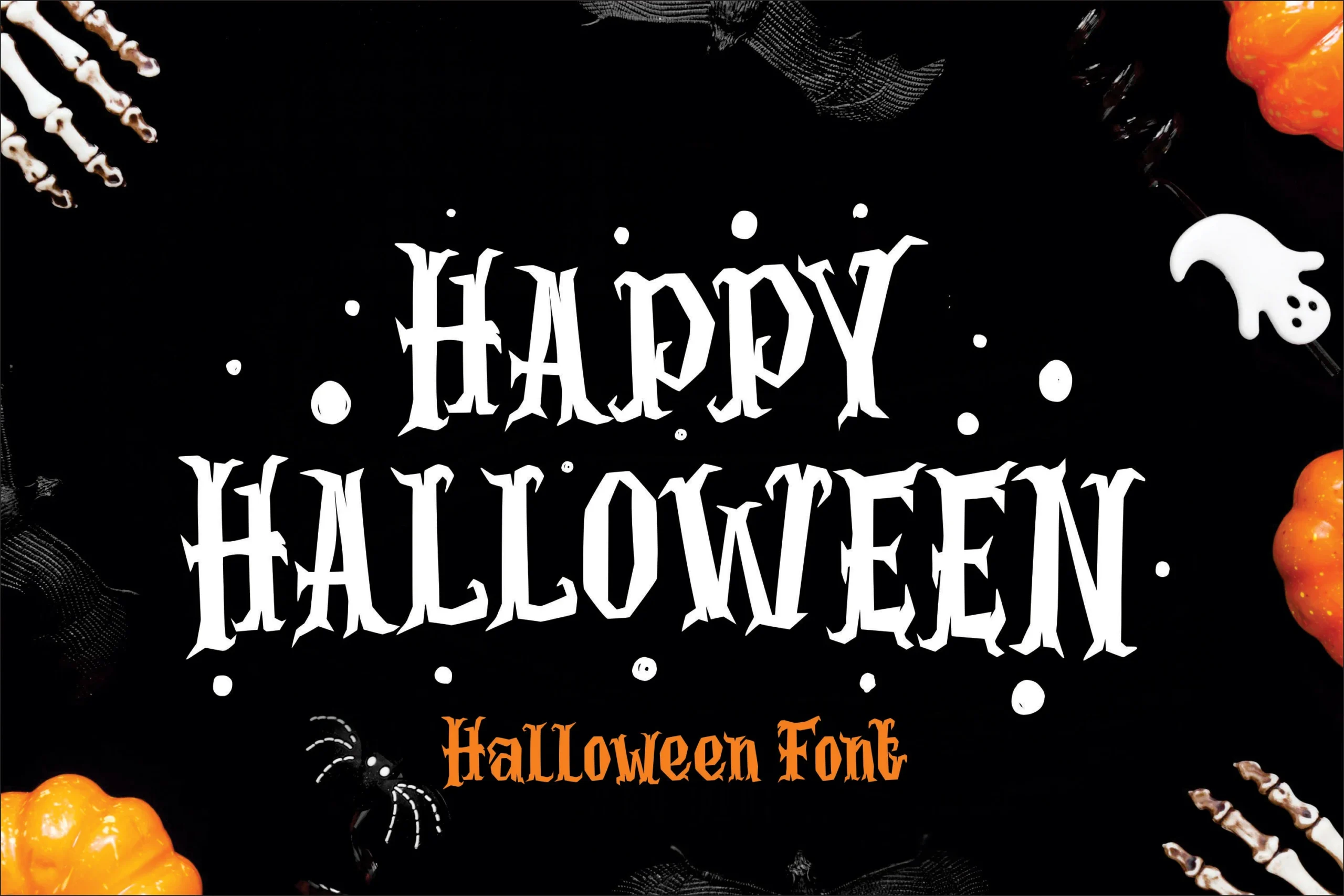
Best For: posters, merch design, display text, headlines
Halloween Font makes Gothic Halloween Fonts immediately thematic with narrow proportions, sharp serifs, high contrast, and jagged terminals. Its condensed footprint is practical for apparel, crafts, and embroidery, while the irregular edges remain better suited to prominent headlines than small lettering or body copy.
Spookora Font
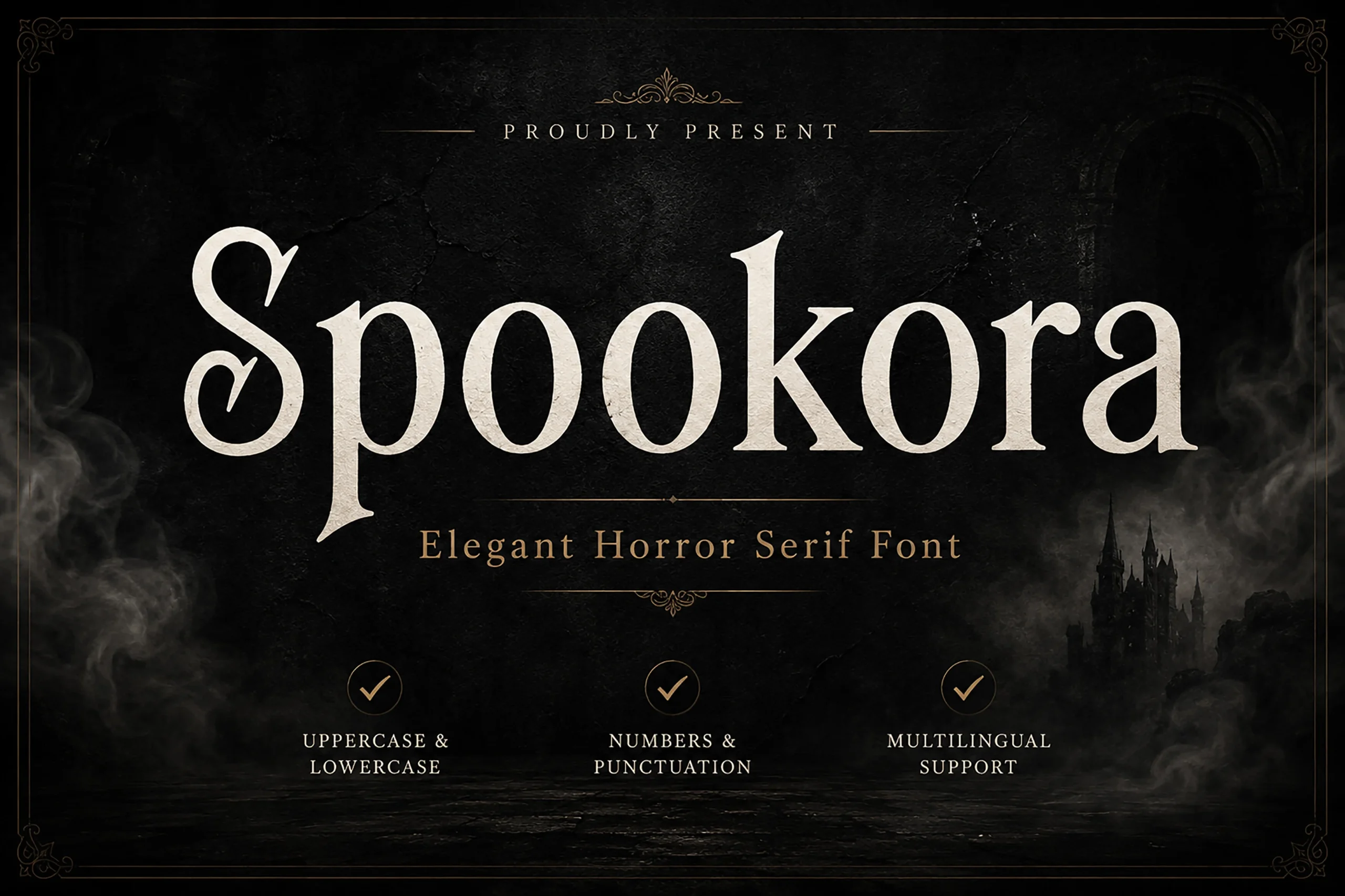
Best For: logos, posters, display text, headlines
Spookora Font places a decorative swash on the initial uppercase S within its Gothic Halloween Fonts serif structure. Sharp triangular serifs and high contrast support a refined vintage-horror title treatment, especially in logos and posters. The flourish and intricate terminals require display scale rather than continuous reading.
How to Choose the Right Font
Choose by construction first: condensed blackletters save space but need large sizing, distressed and dripping faces add surface texture at the cost of clarity, and ornate serifs provide more formal title shapes. For Gothic Halloween Fonts, reserve the most intricate options for short headlines, logos, posters, and apparel, then test every choice at its final production size.